 Live Preview


86+
Successful Sales

4.7
Reviews & Ratings
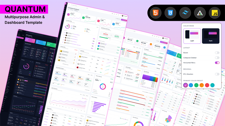
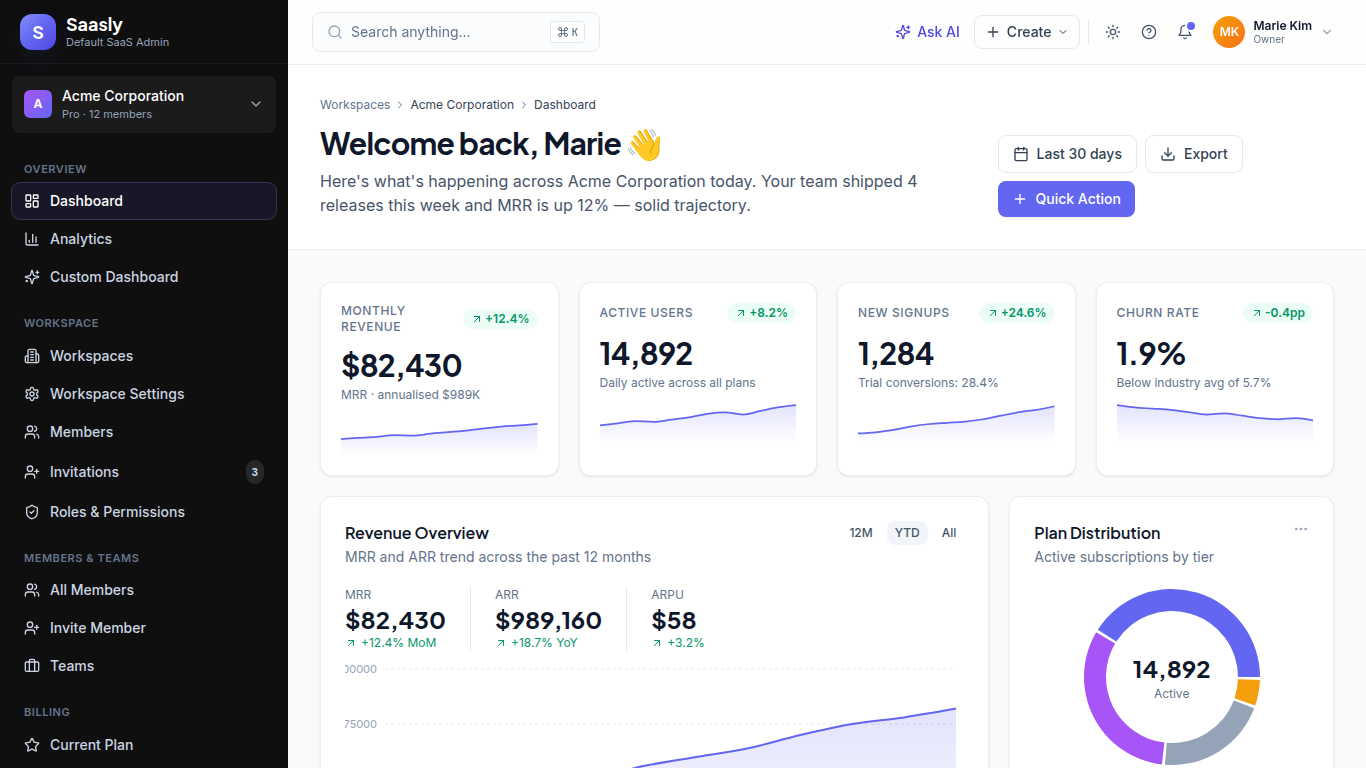
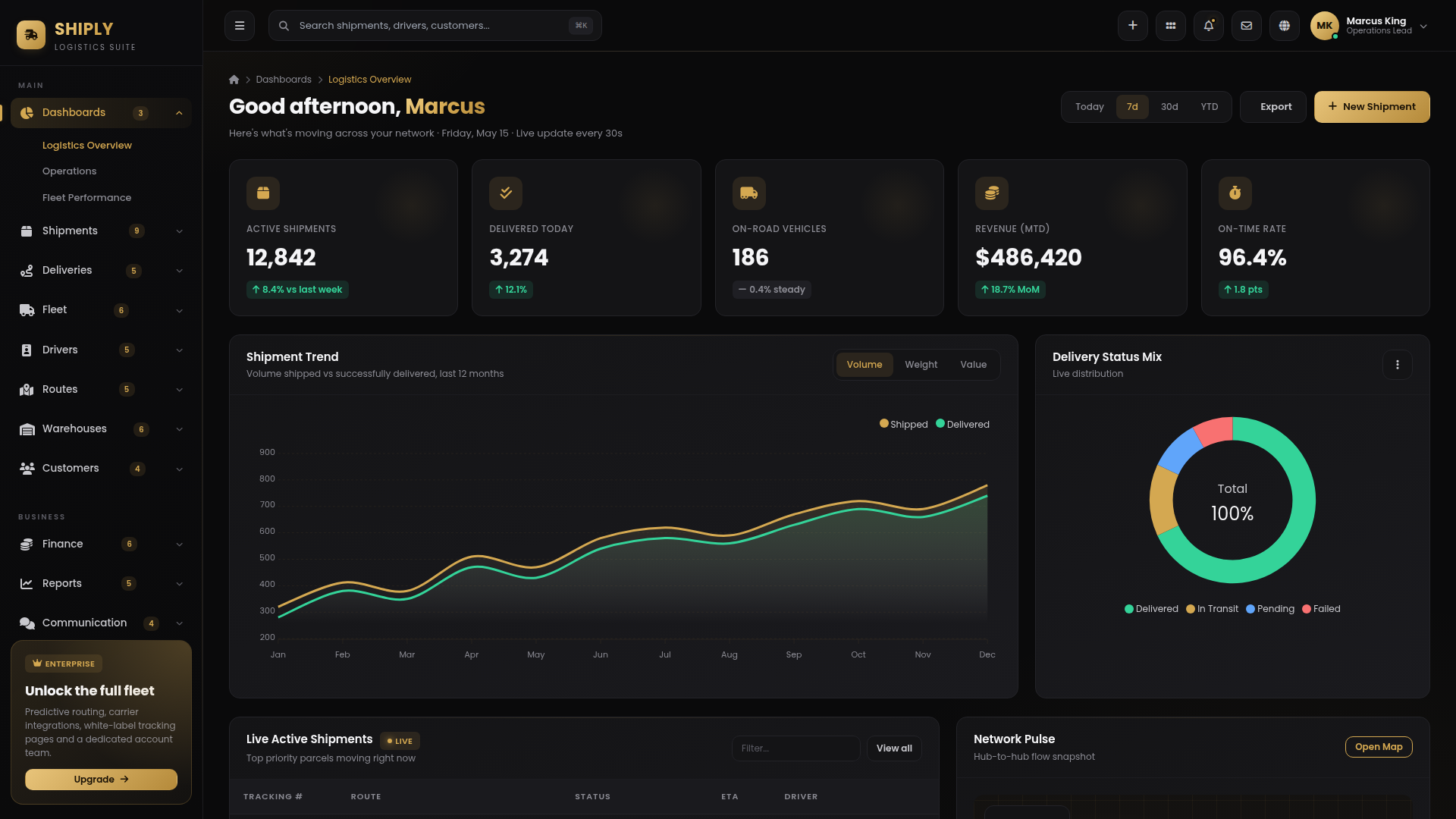
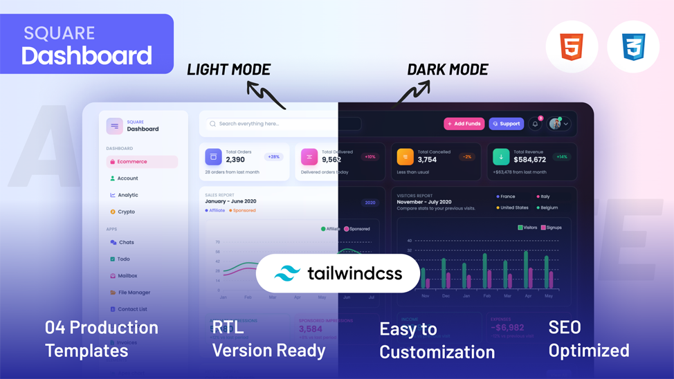
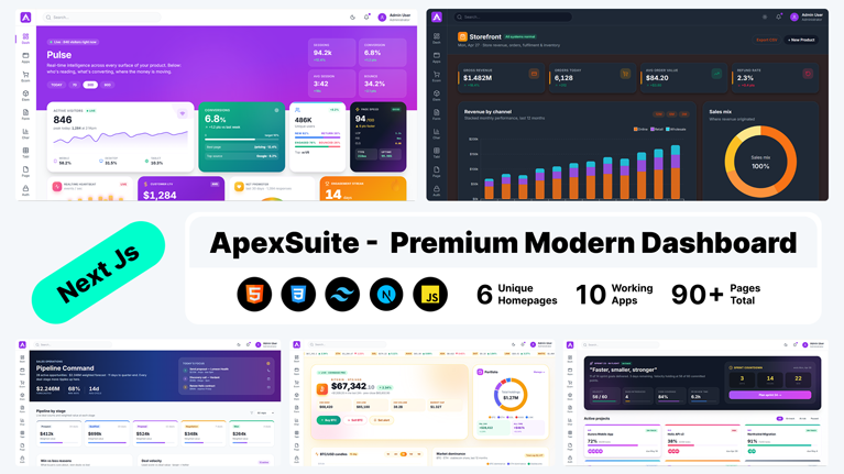
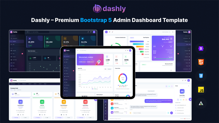
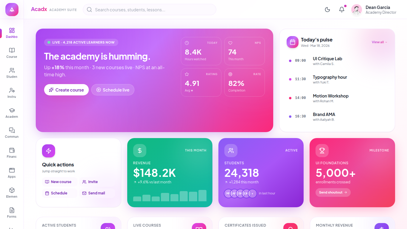
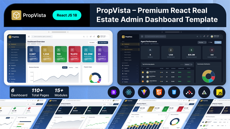
Customize dashboards in minutes with Tailwind admin templates from MyCreativeTemplates. Utility-first components, dark mode, responsive layouts, and prebuilt screens for analytics, tables, and auth, available for HTML, Next.js, React, and Vue stacks.
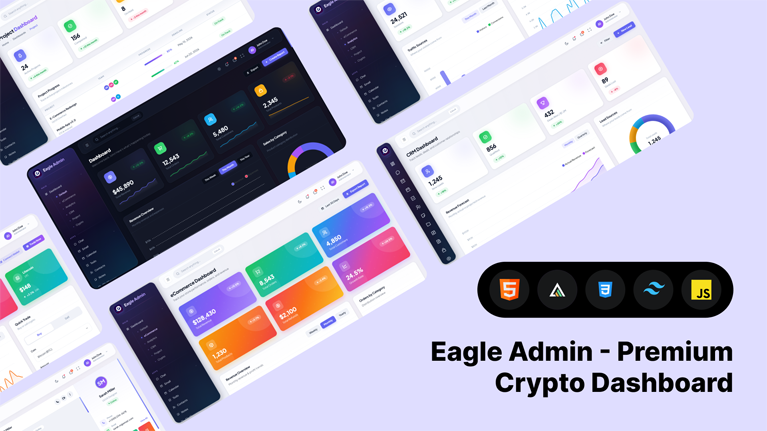
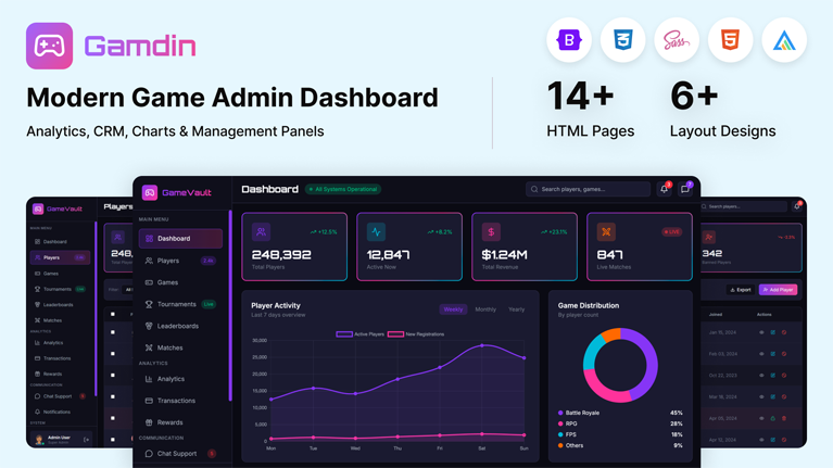
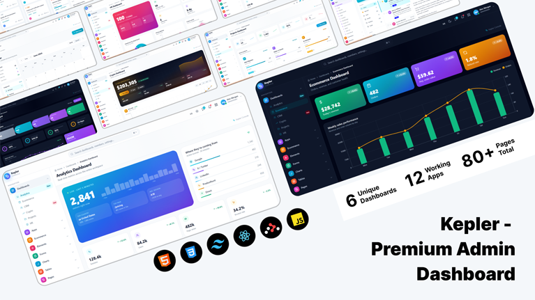
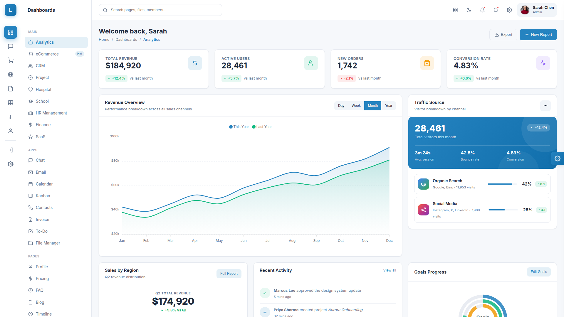
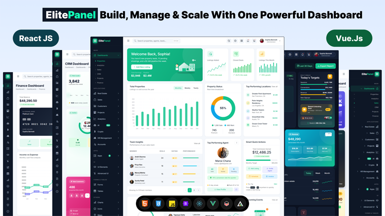
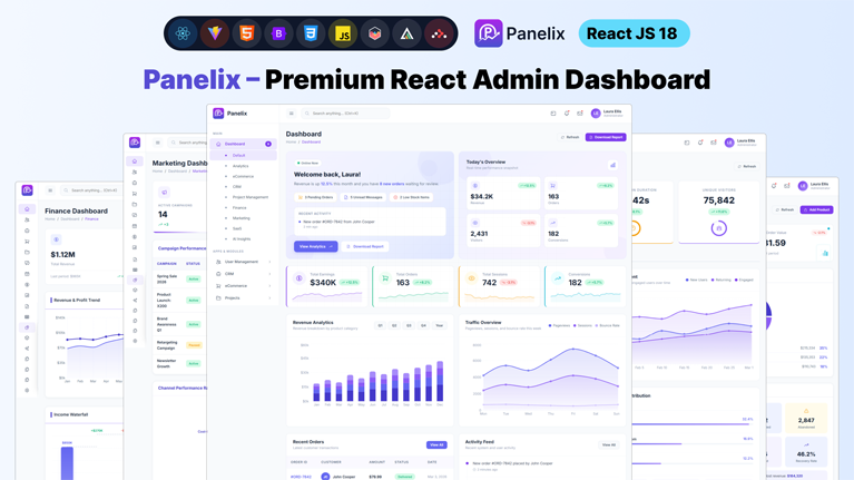
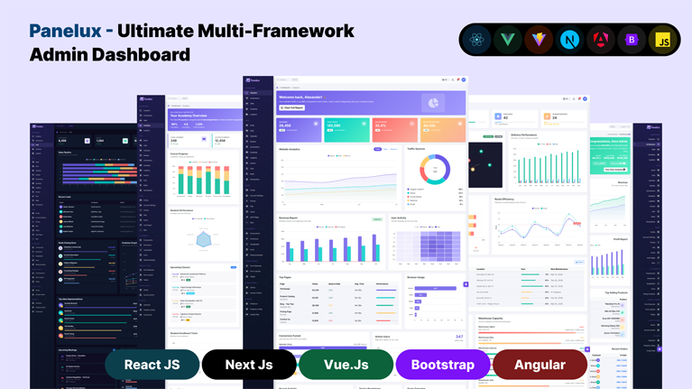
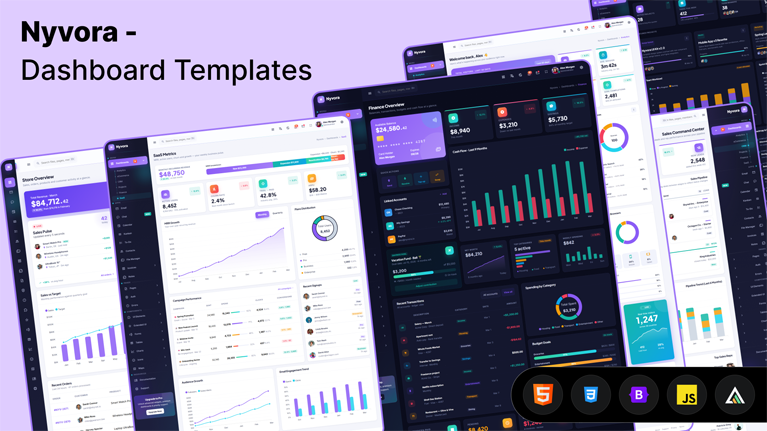
Discover our latest modern, responsive, and developer-friendly admin dashboard templates.
Discover our most popular modern, responsive, and developer-friendly admin dashboard templates.
Tailwind CSS gives developers extraordinary design freedom, yet building a polished interface still takes time because dashboards, layout grids, navigation layers, and reusable components must work together before the application begins to feel like real software.
Discover our most popular modern, responsive, and developer-friendly admin dashboard templates.

A potential client decides if they trust an accounting firm within seconds, and the website does most of that work...
 July 6, 2026

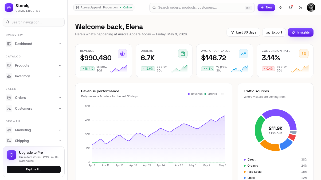
A dashboard is only useful when the data on it is easy to read. Most teams lose days wiring up...
July 3, 2026

Most CRM products are not built from scratch. Building a pipeline view, contact management interface, deal analytics, and role-based navigation...
July 2, 2026

Building an ecommerce admin panel from scratch takes weeks. You wire up order tables, build product forms, scaffold inventory views,...
June 30, 2026

Most Vue developers waste the first two weeks of a new project rebuilding the same dashboard scaffolding they built on...
June 23, 2026

Building a React admin from scratch takes most teams 2 to 3 weeks. That time goes to routing, sidebars, dark...
June 23, 2026
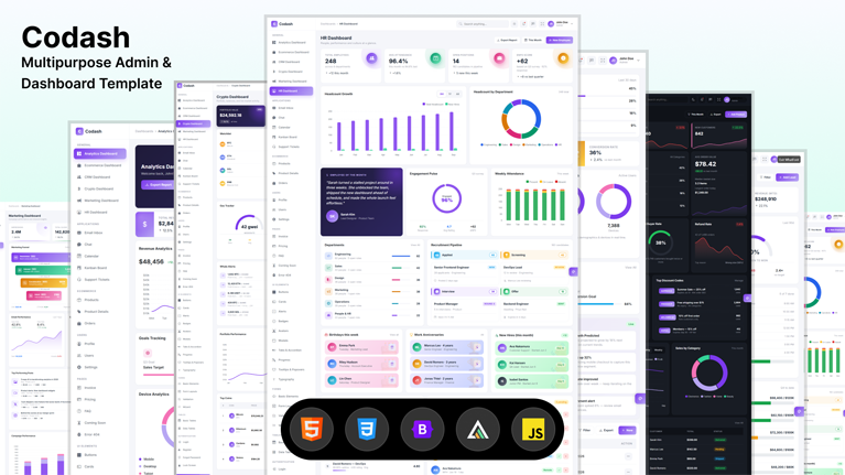
Tailwind CSS admin templates give developers a faster way to build dashboards, SaaS apps, and internal tools without creating the...
June 10, 2026

You download a template that looks perfect in the preview. Two days later you find out the auth pages are...
June 10, 2026
Answers to the questions we hear most about these templates.
A Tailwind CSS admin template is a pre-built dashboard interface created with Tailwind utility classes. Tailwind admin templates include layouts, authentication pages, tables, forms, navigation systems, and reusable UI components that help developers accelerate frontend application development.
Tailwind admin templates use utility-first styling directly in the markup rather than relying on predefined component classes like Bootstrap admin templates do. This gives developers more flexibility when customizing dashboard interfaces and reduces the need for large CSS overrides as projects scale, while Bootstrap focuses more on ready-made components and a more opinionated structure.
Yes. HTML-based Tailwind admin templates can integrate with Laravel, Node.js, Django, and other backend environments. Authentication screens, dashboard layouts, forms, and data tables are structured to connect with real application data and APIs.
No. Tailwind admin templates can work as standard frontend projects without advanced Tailwind expertise. Developers familiar with Tailwind CSS can customize utility classes more deeply, but a basic implementation does not require advanced knowledge of the framework.
Dark mode in Tailwind admin templates is implemented using Tailwind’s native dark: utility system directly inside the markup. Both light and dark interface styles are defined at the component level to maintain visual consistency across dashboard pages and UI elements.
Yes. Tailwind dashboard templates use responsive breakpoint utilities such as sm:, md:, lg:, and xl: to adapt layouts, navigation systems, tables, and dashboard components across desktop, tablet, and mobile devices.
No. HTML-based Tailwind admin templates are pre-compiled and ready to use immediately after download. A Tailwind build setup is only necessary when developers want to modify the Tailwind configuration or generate additional utility classes.
From strategy to execution, we help you create powerful digital experiences that drive real results.