


 Purchase Now
 Live Preview


 Purchase Now

Description
Vuenix is a premium Vue 3 admin dashboard template built for serious operators — SaaS founders, agencies, freelancers and internal tooling teams who need a back-office surface that takes itself seriously. Built with Vue 3, Vite 5, Tailwind CSS 3 and Chart.js 4, Vuenix ships with seven visually distinct dashboards, more than seventy ready-made pages, a fully tokenised design system and an editorial typography stack anchored on Fraunces serif numerals.
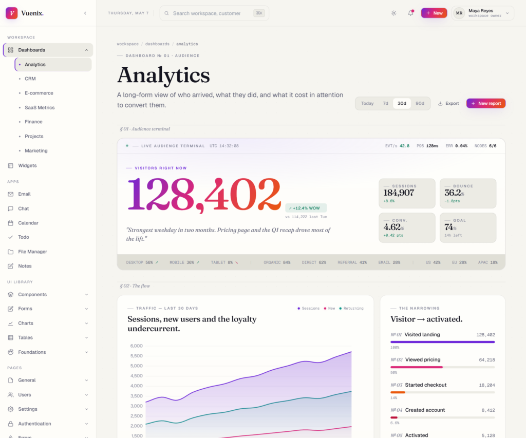
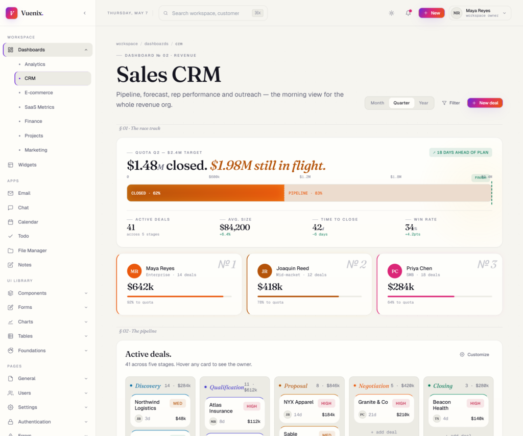
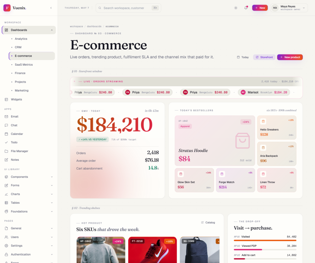
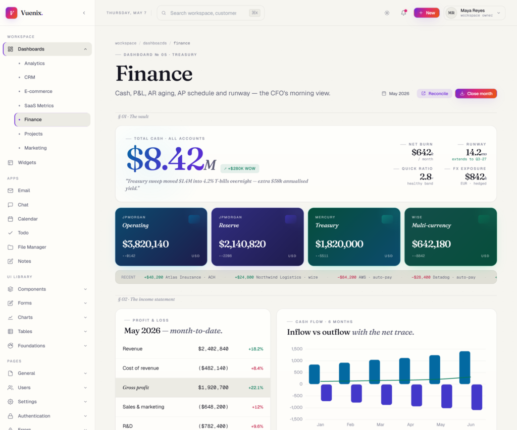
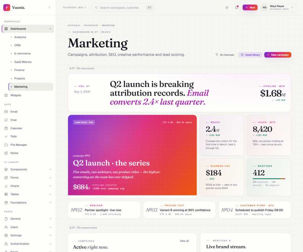
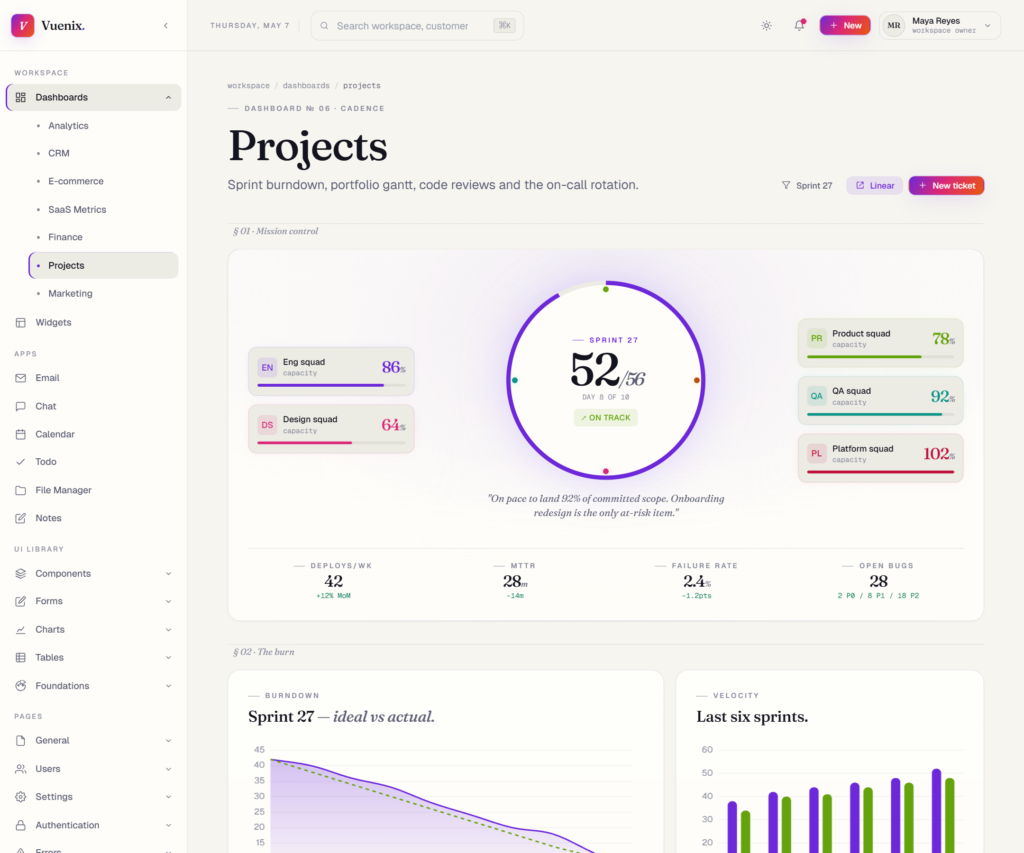
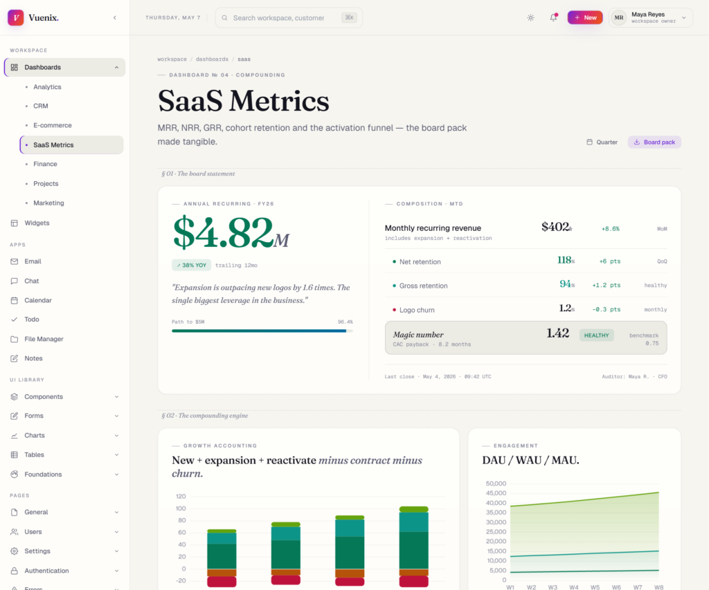
Unlike most admin templates that swap data into the same four-up KPI rectangle, every Vuenix dashboard uses a different layout grammar. The Analytics dashboard reads like a Bloomberg terminal. CRM frames itself as a quota race track. E-commerce pulls in a live storefront marquee. SaaS Metrics reads like a financial board statement. Finance shows bank balances as physical credit cards. Projects surrounds a sprint dial with team capacity satellites. Marketing is laid out like a newspaper front page. The result is a suite that feels coherent without feeling repetitive.
What’s included
Seven purpose-built dashboards
- Analytics dashboard — Live audience terminal, sessions chart, behaviour funnel, engagement heatmap, top pages table and live event stream.
- CRM dashboard — Quota race track, kanban pipeline across five stages, deal velocity, rep leaderboard, win/loss reasons, today’s agenda and outreach queue.
- E-commerce dashboard — Live order marquee, GMV pulse, trending products with real photography, cart abandonment funnel, sales heatmap, channel attribution.
- SaaS Metrics dashboard — Board-style statement card, growth accounting waterfall, DAU/WAU/MAU stickiness, plan distribution, activation funnel, cohort retention matrix and live A/B experiments.
- Finance dashboard — Cash position banner, four bank account cards rendered as physical credit-card tiles, P&L statement, cash flow chart, AR aging, AP schedule, vendor spend and runway projection.
- Projects dashboard — Mission-control radial dial with team capacity satellites, sprint burndown, velocity, portfolio gantt, blockers register, code review queue and on-call rotation.
- Marketing dashboard — Newsstand front-page mosaic, campaign performance table, brand mentions stream, attribution polar chart, spend-to-pipeline mixed chart, email funnel, SEO movement and creative gallery with real images.
Seventy-plus pages
- UI library — Buttons, cards, badges, modals, alerts, dropdowns, tabs, tooltips, accordions and pagination — every component fully working with state.
- Forms — Basic, advanced, validation, layouts, wizard, file upload and input element catalog.
- Charts — Line, bar, pie, mixed, showcase and statistic card pages built on six theme-aware Chart.js wrappers.
- Tables — Basic, data (sortable + searchable + selectable), responsive, editable and filterable patterns.
- Foundations — Icons, typography, color system, grid and spacing reference pages.
- Apps — Email, chat, calendar, todo, file manager and notes — each fully interactive.
- General pages — Profile with boarding-pass cover, settings hub, pricing comparison, FAQ, timeline, invoice, search results, notifications inbox.
- Users — Members list, user profile, roles and permissions matrix, activity log.
- Settings — General, security (2FA, SSO, API keys), notifications matrix, billing.
- Authentication — Login, sign-up with live password strength, forgot password, reset, OTP verification with auto-advance cells, lock screen.
- Errors — 404, 500, 403 forbidden, maintenance.
- Workspace — Widget library showcase with twenty-eight ready-to-copy tiles.
Editorial design system
- Dark-first design with a refined light mode in pearl/cream tones — every token paired across both modes.
- Fraunces serif for display headings and tabular numerals, Geist sans for body text, Geist Mono for code and tabular figures.
- 13 accent colours (brand, violet, pink, orange, coral, emerald, teal, amber, lime, sky, indigo, fuchsia, rose) each with a soft tint and a glow shadow variant.
- Five named gradients — aurora, meridian, equinox, vesper and noir — used sparingly to anchor heroes and CTAs.
- Bento grid layouts with asymmetric 12-column compositions instead of repeating four-up KPI rows.
- 120+
.vy-*component classes covering cards, buttons, badges, inputs, switches, tables, avatars, KPIs, tiles, hero banners, ring gauges, donuts, sparklines, bar rows, segmented controls, timelines, modals, glass panels, toasts and a live ticker marquee.
Tech stack
- Vue 3 with the Composition API and
<script setup>syntax. - Vite 5 bundler with hot module replacement and route-level code splitting.
- Vue Router 4 in HTML5 history mode with subpath deployment support.
- Tailwind CSS 3 with
darkMode: 'class'and a custom theme that maps to the design tokens. - Chart.js 4 + vue-chartjs 5 via six bespoke wrappers that read CSS variables and re-render on theme changes.
- Google Fonts — Fraunces, Geist, Geist Mono, Inter, JetBrains Mono.
Working interactivity
- Every dropdown, modal, accordion, tab, tooltip and form actually works — no static mockups.
- Tooltips and popovers teleport to the document body so they never get clipped by parent overflow or stacking contexts.
- Forms validate on submit and on blur with live error messages, password strength meters, async username availability checks, conditional rules and dynamic field arrays.
- The chat app supports a working composer with simulated replies and a properly scrolling message thread.
- The todo app supports add, complete, delete and filter with a live progress bar.
- The email app marks messages read on click and decrements the inbox counter.
Themed Chart.js with auto dark mode
The chart theme bridge in src/charts/setup.js reads every Chart.js colour from CSS variables, listens for class mutations on the <html> element to detect dark-mode toggles, and re-emits to all chart wrappers. Tooltips invert correctly between modes, axis colours follow the surface tokens, and area gradients are computed with a defensive withAlpha helper that handles hex, rgb, rgba and CSS-named colours without producing NaN values.
Customisation in one file
All design tokens live in assets/css/styles.css. Edit one CSS variable to change the brand colour everywhere. Replace the aurora gradient stops to recolour every hero and signature CTA. Switch the typography stack at the :root level. Components inherit through CSS variables, so customisation does not require touching any component file.
Global Vuenix API
The Vuenix object attached to window exposes toast() for top-right notifications with five tones, setTheme() / toggleTheme() / onThemeChange() for theme management, onHotkey() for keyboard shortcut handling and copy() for clipboard interactions. URL ?theme=light|dark|system overrides apply on initial load and on every SPA navigation.
Keyboard shortcuts
Cmd/Ctrl + Kfocuses the navbar search.Cmd/Ctrl + Btoggles the sidebar collapse.Cmd/Ctrl + Jtoggles dark mode.Esccloses any open dropdown, modal or popover.
Production ready
npm run buildproduces route-split chunks indist/with hashed filenames for long-term caching.- A bundled Apache
.htaccesshandles SPA fallback, gzip compression, immutable hashed-asset caching and security headers (X-Content-Type-Options,X-Frame-Options,Referrer-Policy,Permissions-Policy). - Subpath deployment is supported through Vite’s
baseoption and the router’screateWebHistory(import.meta.env.BASE_URL)setup. - Compatible with Vercel, Netlify, Cloudflare Pages, Apache, Nginx and any static host.
- Comprehensive self-contained
documentation.htmlfile included.
Responsive on every viewport
Mobile-first design with a slide-over sidebar drawer, collapsing 4-column grids that reflow to 2 or 1 column on smaller breakpoints, horizontal-scroll or stacked-card alternatives for tables, and 44×44 pixel touch targets for every interactive element. The 3-pane apps (email, chat) collapse cleanly to a single pane on narrow viewports.
Who Vuenix is for
Vuenix is built for SaaS founders shipping a customer-facing dashboard, agencies delivering bespoke admin panels for clients, freelancers who need a credible starting point that doesn’t look like a clone, internal tooling teams replacing spreadsheets with proper interfaces, and anyone building back-office software for finance, analytics, CRM, e-commerce, project management or marketing operations. If you’re tired of admin templates that all look the same, Vuenix is the alternative.
Why Vuenix is different
Most premium admin templates pick a single hero pattern and reuse it across every dashboard with different colours. Vuenix uses a different layout grammar per dashboard, an editorial design language with serif numerals as the protagonist, asymmetric bento grids instead of four-up KPI rows, dark-first surfaces with bioluminescent accent glows, real product photography on commerce pages, and an entirely tokenised CSS system that lets you re-skin the whole template by editing a handful of variables.


