


 Purchase Now
 Live Preview







 Purchase Now

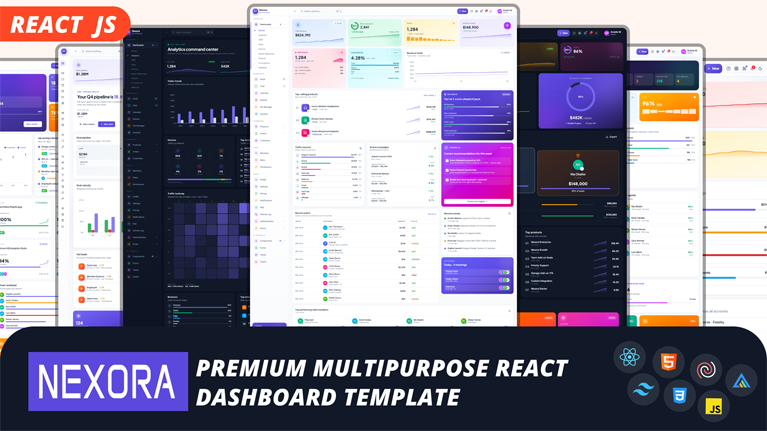
Nexora is a production-ready, enterprise-grade admin dashboard template built with React 19, Vite 8, TypeScript and Tailwind CSS v4. It ships with nine distinct role-tuned dashboards, sixty-plus fully-designed pages and more than thirty reusable UI components — all wired, typed and dark-mode native. Whether you are building a SaaS product, an internal tool or a client back-office, Nexora saves weeks of design and engineering effort.
Why choose Nexora
- Nine unique dashboards — no two share the same layout, KPI mix or chart composition.
- Sixty-plus pages already built — apps, e-commerce, users, auth, errors, UI galleries.
- Thirty-plus reusable components — buttons, cards, modals, drawers, tables, forms and more.
- Sixteen chart types themed for both light and dark modes out of the box.
- Thirteen fully working form patterns with real Zod validation.
- Strict TypeScript across every file — zero implicit any, zero dead code.
- Class-based dark mode toggle wired into every card, chart and badge.
- Command palette (Cmd+K) for keyboard-first navigation.
- Responsive from 375px phones to 1600px+ ultrawide displays.
- Framer Motion animations tuned for polish, never distraction.
Modern technology stack
Nexora runs on the latest major version of every dependency. Vite 8 with Rolldown delivers sub-second hot module reload, TypeScript 7 enforces strict types, and Tailwind CSS v4 uses CSS-first design tokens with no PostCSS or config file overhead. React Router 7 handles client-side routing, ApexCharts 6 renders all sixteen chart types, and TanStack Table 8 powers every data grid.
- React 19.2 with the concurrent renderer.
- Vite 8.2 with Rolldown for lightning fast dev and build.
- TypeScript 7 in strict mode.
- Tailwind CSS 4.3 with CSS-first @theme tokens.
- React Router 7.18 with basename support for sub-path deploys.
- ApexCharts 6.7 for charts, react-apexcharts 2.1 as the React wrapper.
- TanStack Table 8.21 for sortable, searchable, paginated grids.
- React Hook Form 7.84 with Zod 3.25 schema validation.
- Framer Motion 12.43 for animations and transitions.
- Lucide 0.577 for over five hundred crisp SVG icons.
- React Hot Toast 2.6 for rich notification toasts.
Nine unique dashboards
Every dashboard tells a different business story. Layout, KPI hierarchy, chart mix and widget composition are handcrafted for each domain — you never see the same design twice.
- Default Overview — command center with sparklines, Q4 OKR tracker, top products, AI insights, active campaigns and a live orders table.
- Analytics — realtime visitor ticker, bar chart, device donut, traffic heatmap, audience mix, top pages, geographic breakdown and a colorful acquisition funnel.
- CRM — pipeline health with a hot-deal spotlight, five gradient pipeline stages, deal velocity chart, lead sources, hot leads table and customer segments.
- Sales — revenue command center with a quota ring, podium leaderboard, rep table, revenue vs target chart, top products and four regional gradient tiles.
- Finance — cashflow cockpit with a credit-card style balance hero, money in and out cards, combo cashflow chart, budgets, transactions and savings goals.
- Human Resources — people pulse with vital stats, a team happiness ring, headcount growth chart, department tiles, new joiners and a wellness metrics row.
- Projects — delivery hub with a featured project spotlight, gradient KPI tiles, velocity chart, milestones timeline, eight project cards, risks and sprint stats.
- E-Commerce — storefront central with best-seller feature, sales channels chart, fulfillment dial, product catalog, live orders and four promo campaign tiles.
- Helpdesk — support operations hub with a dark hero, live queue, ticket volume chart, channel breakdown, agent leaderboard, sentiment card and trending FAQs.
Sixty-plus pages included
Beyond the dashboards, Nexora ships with every page a real product needs — no more scrambling for a signup screen or an empty state at 2am. Everything is styled, typed and functional.
- Six application pages — Email inbox, Chat with rooms, Calendar, Kanban board, File Manager and Invoices.
- Six e-commerce pages — Products catalog, Add product form, Categories, Orders, Refunds and Customers.
- Three user access pages — Team Members, Roles cards and a Permissions matrix.
- Six utility pages — Profile, Settings, Pricing, Notifications, FAQ and Activity Log.
- Six authentication flows — Sign in, Sign up, Forgot Password, Reset Password, Two-Factor and Verify Email.
- Five error pages — 404 Not Found, 403 Forbidden, 500 Server Error, Maintenance and Coming Soon.
- Fifteen UI element galleries — Components, Buttons, Cards, Alerts, Avatars, Badges, Modals, Toasts, Typography, Icons, Pagination, Timelines, Forms, Tables and Charts.
Rich component library
Every component is written from scratch, follows the same design tokens and works in both light and dark themes. Components accept sensible defaults and expose the props you actually need — no over-abstraction.
- Buttons with eight variants, five sizes, loading and disabled states.
- Cards for stats, articles, products, profiles, pricing and feature blocks.
- Modal and Drawer with focus trap, keyboard support and multiple sizes.
- Data tables with search, sort, pagination, column filters and one-click CSV export.
- Forms with fifteen inputs, thirteen working example patterns and Zod validation.
- Alerts, badges, chips, tabs, accordions, avatars, tooltips and dropdowns.
- Toast notifications with promise, custom, success, error and loading variants.
- Command palette with fuzzy search and keyboard shortcuts.
- Timeline, stepper, pagination and progress components.
- Sparkline primitive for lightweight inline trend lines.
Working forms and validation
Nexora includes thirteen production-ready form patterns, each with real state, real validation, and real feedback. Every input, button and message ships pre-wired.
- Sign in with email and password validation.
- Sign up with a live password strength meter and confirm match check.
- Contact form with topic select and character counter.
- Change password with a live requirement checklist.
- Payment form with card number formatting and brand detection.
- Multi-step onboarding wizard with animated stepper.
- OTP verification with auto-focus advance and countdown timer.
- Rating and feedback form with hover-preview stars.
- Drag and drop file upload with simulated per-file progress.
- Team invite with dynamic add and remove rows.
- Search and filter with live summary preview.
- Address form with country to region cascade.
- Newsletter subscribe with instant email validation.
Sixteen chart types
Every chart is wired to real data, themed for both modes, and responsive. The Chart wrapper applies smart defaults per chart family so you never need to configure axes or fills for a pie chart or a bar chart manually.
- Line chart with multi-series and smooth curves.
- Area chart with gradient fills.
- Stacked area chart for cumulative segments.
- Stepped line chart for discrete events.
- Column and bar chart with rounded caps.
- Horizontal bar chart for category comparison.
- Stacked column and distributed column charts.
- Pie and donut charts with center totals.
- Radial bar and polar area charts.
- Radar chart with multi-metric spider.
- Scatter and bubble charts.
- Heatmap chart with four-tier color scale.
- Treemap chart with distributed colors.
- Candlestick chart with OHLC financial data.
- Box plot chart for five-number summaries.
- Mixed chart with bars and line overlay.
- Timeline and range bar chart for Gantt schedules.
Dark mode and design system
Dark mode is not a bolt-on. Every card, chart, badge, alert, and gradient has its own dark value defined in the CSS-first @theme block. Toggle instantly with the sun and moon icon in the header, or programmatically via the Theme context.
- Class-based dark mode toggle stored in localStorage.
- Custom brand palette centered on #7367f0 purple.
- Surface, ink, night and semantic color scales.
- Typography scales for Inter, Plus Jakarta Sans and JetBrains Mono.
- Soft, card, pop and glow shadow tokens.
- Custom animations, keyframes and easing functions.
- All tokens defined in a single @theme block in index.css.
Developer experience
Nexora is engineered to feel great in your terminal and in your editor. Hot reload is instant, TypeScript intellisense is complete, and the folder structure is easy to reason about.
- Clean folder structure organized by feature.
- Path aliases with @/ pointing to src/.
- Reusable hooks and context providers.
- Modular architecture that scales to hundreds of pages.
- Puppeteer script for generating marketing screenshots.
- Vite 8 with sub-second hot module reload.
- Strict TypeScript across every file.
- Lightning CSS pipeline built into Tailwind v4.
Production ready
Deploy anywhere. Nexora builds to a static single-page application that runs on Apache, Nginx, Vercel, Netlify, Cloudflare Pages, GitHub Pages or any static host. A conditional base path lets you deploy under a subfolder, and the included .htaccess file handles SPA rewrite, gzip compression, long-term caching and security headers.
- Vite conditional base path for sub-folder deployment.
- React Router basename read from the build base URL.
- .htaccess for Apache with SPA rewrite rules.
- Gzip and DEFLATE compression for HTML, CSS, JS and SVG.
- Long-term cache headers with immutable hashed asset filenames.
- Security headers including X-Content-Type-Options and Referrer-Policy.
- Custom 404 fallback to the SPA shell.
Who is it for
- SaaS founders launching a new admin panel or dashboard.
- Agencies delivering internal tools for enterprise clients.
- Startups building customer-facing analytics and reporting products.
- Freelancers who need to ship a polished back-office in days, not months.
- Product teams standardizing on a modern React and Tailwind stack.
- Developers who want a reference implementation of best practices.







 Live Preview